
Paint Them a Picture: Engage Your Partners with Data Visualization

Paint them a Picture:
Engage your partners with data visualization
By Andy Page
A few years ago, I was tasked with creating reports for our program advisory group. These reports were used to inform the group about our programs on such things as enrollments, student grades, course completions, attendance rates, certification rates, etc. I was new to this position and was given examples of the huge spreadsheet reports that were presented in the past and was directed to follow these examples because this is what the group was expecting. You know, this is how it’s always been done.
So, I started collecting all the data and started inputting it into these big spreadsheet reports, column by column and row by row by row (there were lots of rows). I added some highlights and formatting to try to make the reports cosmetically appealing, verified the data one last time, and off to print they went.
Now here it was, meeting day. I passed out the reports and began trying to explain the information to the group. Look at the first column and follow along this row move to the last column three rows down and turn the page over to see the rest of the data and on and on and on. As I watched eyes glaze over and a few eye rolls, I thought I’m not explaining this correctly, this is important stuff, why aren’t they interested? After the meeting ended, as I was leaving the room, I noticed most of the reports were left behind on the tables or in the trash. I couldn’t help thinking Where did I go wrong? This is what they’ve always received. This is how it was always done.
Our next meeting was coming up in just a few weeks and I couldn’t shake the response the reports I presented at the last meeting received. I started thinking about what I was presenting and how I was making the group work to get the answers they needed. Why wasn’t I just giving them the answer? Aha, light bulb! That’s it, I need to give them the answers. I was a bit nervous because that meant changing the reports they were used to receiving. How would this go over? I mean this in not how it’s always been done. After a bit of reflection, I decided to take the chance. I needed to change the reports and the way information was being presented to this group. I needed to paint the picture for them!
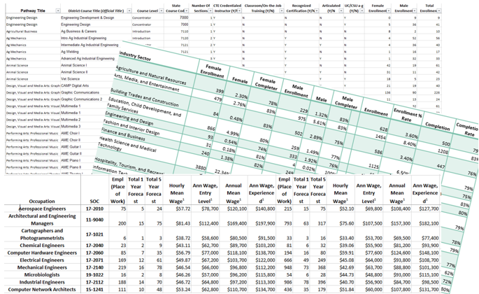
So, I took that data on those spreadsheets and started creating charts and graphs and anything else I could think of that wasn’t a bunch of numbers that went across a sheet in a bunch of columns and rows. This was great, except now I had a bunch of charts and graphs on different sheets that weren’t really putting the whole picture together. I decided not everything had to be reported in a chart or graph, I could just put a number on a page with a brief description. I played around a bit and finally came up with something that fit on two pages (printed back to back) that would give the group the answers they were looking for without having to work for it. I went from these monotonous overbearing spreadsheets to an easy to read picture.

Here we are again, it’s meeting day. I was a bit nervous. I knew I would be changing the presentation format, something the group wasn’t used to. The moment of truth. I handed out the reports and started to explain the information on the sheets. Before I could get through the first visual, one of the group members shouted out “Hey, look at our completion rate!” and another followed with “We had the highest enrollment!” (no competition there). The comments when on and on and not once did I have to explain what they were looking at. The interest and enthusiasm in the room was exciting to see and experience. After the meeting as I was leaving the room, I glanced back and noticed no reports were left on the tables. I quickly glanced to the trash and noticed it was empty. I smiled, closed the door, and walked away with the knowledge that this experiment was a success.
We all have those moments when we must report or present information on a project, a grant, or a program to stakeholders such as parents, advisors or school superintendents and boards. Most of the time you’re limited to the amount of time you have to present. What I’ve learned over the years is they’re interested in what you have to say, but they don’t have much time. And nobody wants to work to find or understand the answers. To be successful in your presentations, to get the response you need or the ask you’re requesting, give them the answers they’re looking for. Paint them a picture. And challenge the way it’s always been done by trying something new. It can be nerve racking, but you may surprise yourself with what’s possible when you put yourself out there. I continue to try new ways of making data accessible and hope you’ll help me think of new ways to do so.
To see more examples of Data Infographic Reports, click the following link: LMI Infographics